Sunday 28 January 2018
Saturday 27 January 2018

Friday 26 January 2018


Thursday 25 January 2018
Evaluation - What have you learnt from your audience feedback?
At the start of December 2917, we completed our first draft of our music video. Our first draft was only 3 minutes long and did not have many effects included. We presented our first draft to the class and were given feedback from our classmates and our teachers. This feedback consisted of:
From the feedback we received we were able to moake changes to the video accordingly. We were really pleased with our final video.
We decided we wanted to get feedback from our final video so we created a couple surveys which I handed out to my A-Level media class and they filled them in. The first survey was a pre-video survey.

We decided to ask these questions to determine if our Target Audience was right.


"Shots of Phoebe going crazy could be broken up with some quick (sped-up) shots in between"
"Could sharpen some parts"
"Some editing needs to be cut more suddenly with the music"
"Needs more shots of Lucy|"
AND
"Good TV effect"
"First effect looks good - really trippy"
"Characterisation + acting was perfect"
"Transitions between each shot flows - ghosting effect matches trippy theme"
We decided we wanted to get feedback from our final video so we created a couple surveys which I handed out to my A-Level media class and they filled them in. The first survey was a pre-video survey.
We decided to ask these questions to determine if our Target Audience was right.


After the class filled out the surveys, they watched the video:
After they watched the clip, we got the class to fill out a post-video survey:
We got mainly got good feedback which showed us a realistic reaction to our video.


We also decided to do a individual interview with one of our classmates. We decided to interview a fellow media student because they know the conventions of our genre and can provide informed feedback.
OUR WEBSITE
Before we started creating our website we carried our someresearch into other websites so we could see how other artisits create band images and synergy throughout their websites. The main website we looked at were the Slaves website:


This was the first draft of our website. On this design we used images taken from our photoshoots for the background.and kept this throughout the website.The images we used were kaleidoscope pictures because we thought it would keep the synergy throughout the video and website. We showed the first draft to ou class and got feedback from them:
Do you want Lucy on the homepage?, too much kaleidoscope imagery, possibly more artist information added, quite dark,
Put interviews on too, possibly add a small biography, make the links stand out more to make it easier for the user to navigate


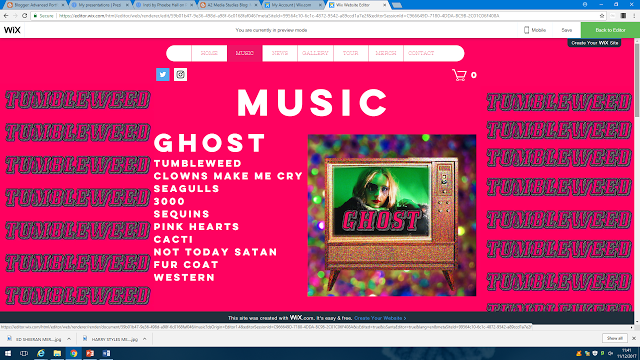
These are some pages from our finished website. Because of this feedback, we decided to create the whole website again. We decided to change the theme of the website from kaleidoscope
images to a plain pink background throughout the whole website. We choose the colour pink to reflect the pink set we used therefore keeping up the synergy and band image. It also made the website more aesthetically pleasing and easier to read and use. We also added a bio about the band and added more pages such as News page and Video page which contains interviews and behind the scenes footage.
We got feedback from our class which consisted of:
*Really good synergy links to your other media products
*Really easy to navigate around the website
*All tabs work
*Like the motion of the logo when you first click on it - good interactivity
*Good use of your images and digipak pictures and video snippets throughout the website
*Layout good
*Gallery shows good images
*News section gives good, useful information
We also created a survey - using survey monkey


We sent the survey out to other student to gain their feedback on the finished website.
The feedback we received was:
*Easy navigation
*Good merch
*All links worked
*Looked really nice
OUR DIGIPAK
We had to create a digipak that fitted our genre themes and should the band images clearly.
This is our first draft:

The overall feedback we got was positive, with it being no9ted that it is unique and attention grabbing. One suggestion was to tint the bottom left photo pink in order to better match the other photos. Our peers liked the grainy effect. Another suggestion was to try and incorporate glitter into it and for us to add borders, a song list and the title of the album. From this feedback we were able to edit our digipak to produce a better product:

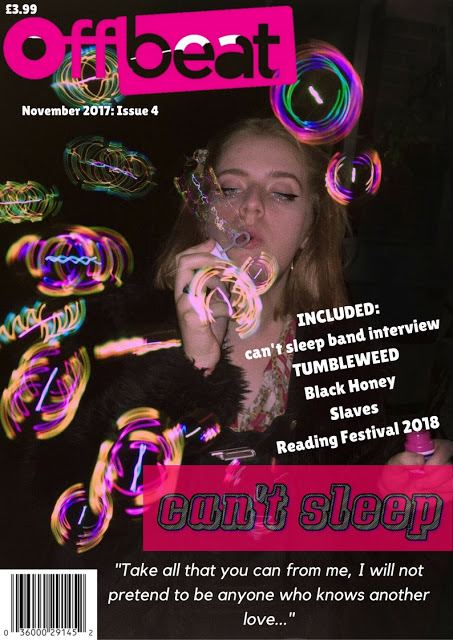
OUR MAGAZINE COVER
We created the magazine cover on a website called Canva. From the research we did, we decided to make the magazine on OffBeat magazine,

This is our first draft of our magazine:

The feedback we got from this was:
*Make Luicy's image stronger - take out the red eye and brighten her
*Make the background less grungy
*Make the text look more proffessional
*Add a barcode
Influenced by our magazine we also made a tour poster:

And a debut album launch poster:

Subscribe to:
Posts (Atom)

-
Carol Vernallis is known for her theory based on music video editing. The 4 key concepts she discusses are: Narrative Editing Camera move...
-
This is the first draft of our music video, which we have titled "Tumbleweed", as a reference to one of the lyrics. Overall I am ...

